
Spreadsheets are great for playing with data. Their free form structure is ideal for designing custom reports. And because Excel is so widely adopted, it is often the tool of choice for creating and sharing information. But with such a range of user experience, we often get spreadsheets that are not well structured, cannot scale or can easily become unmanageable. So I’d love to share some of my best practices for building reports in Excel.
When we want to use Excel to summarize data, our best approach is to treat it as a free form database. We can use the worksheets to replicate database features; Data Tables, Queries and Reports. Here’s how:

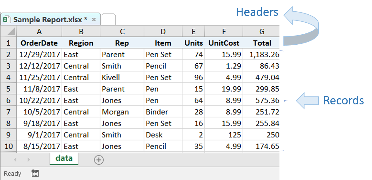
Data Tables are defined as a range of cells that contain related data. The first row of data is reserved for Field Headers and are needed to describe the data in each column. Each column is a “field” (or category, ex: Name, Date, Price etc.) and each row is a “record” (or list item).
When data is formatted in a proper table, Excel recognizes the structure and offers a selection of tools to analyze your data. This tells us that Excel is designed to work with structured data tables.
Tips:
+ Always place your header in row 1, plot your data directly below leaving no blank rows between records. A record must have data in at least 1 of the columns for Excel to “see” that the records below also belong to the table
+ Use Freeze Panes in the View tool bar to keep the headers in view when scrolling down through rows of data

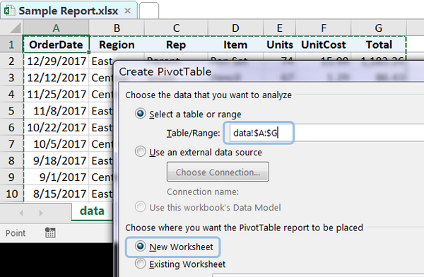
Excel PivotTables are fantastic for reading and summarizing the data in your Table. Because they form a connection with your data, any changes you make, (for example: add more records) can automatically flow through to the PivotTable report.
Let’s create a PivotTable. Start by selecting all the columns on your “Data” worksheet that contain values. Then select PivotTable in your Insert tool bar. Choose to place your PivotTable on a New Worksheet.
Tips:
+ Because we built our data with header values in row1, we can select the entire column of data rather than just a few cells. This way our data table can grow and still be inside the range of the PivotTable. If you choose to only select the cells that currently contain data, you may not remember to expand the range when new values are added
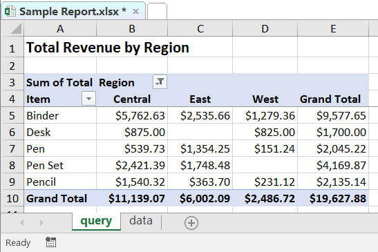
You can then shape your PivotTables to create the views you need for reporting. If you need several views, you can create more than one PivotTable on the Query worksheet

If your PivotTable looks good enough for you, you’re all set, you can use that for your report. If you want to combine data from different sources, run calculations and enjoy freedom to format as you like, then you will need a Report. Create your ideal layout and use the GetPivotData formula to pull data into your report. Create calculated metrics and other automations to make updating easy.
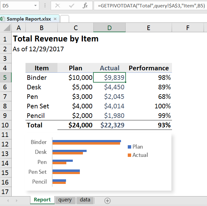
This is an example of a simple Excel file that follows the best practices of; Data, Query and Report. You are welcome to download it here. Take a look at the formulas on the "Report" worksheet, even the date can be automated. I'm hoping this helps and would love to hear from you if you need more. There is so much we can do with a solid foundation for reporting. Please feel free to reach out to me directly if you have any open needs for reporting and analytics.
-Jane